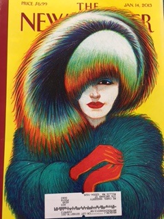
 The artist who illustrated is the Italian Lorenzo Mattoti. He studied architecture and then went on to create comic books. 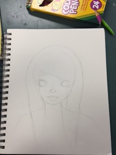 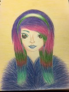 For this project I tried to make it slightly different from the actual cover. I think I made the style a little too different from the cover. I'm not really happy with the final product because I think the colors could have been executed better.
0 Comments
The letters for the project symbolize road, ignite, snake and echo. I like the colored pencil for the letters but I wish the background could be darker and more even. I also think I could have used the negative space more creatively. 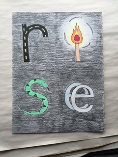 Representing my future self was kind of difficult because I'm not quite sure what I want for my future besides happiness. The pale blue side represents a normal life with a 9 to 5 that may seem successful for most people, but not for me. I made the night side more vivid and colorful to represent the goals I truly want to achieve, and not those that society wants. The moon around the cranes head represents happiness. One thing I feel is off about the painting is the cranes proportions. 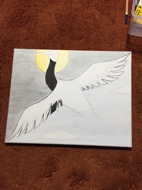 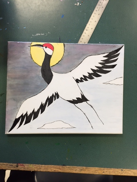 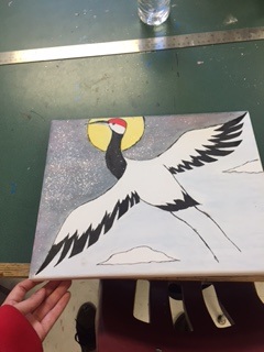 For skill building I chose to do the color wheel, which I found very helpful. It gave me a perspective of colors and their relationship to each other. Also, I really liked a lot of the colors on the third wheel that I previously didn't know how to create. Although I didn't finish every wheel, I still think I gained a lot of knowledge from it. 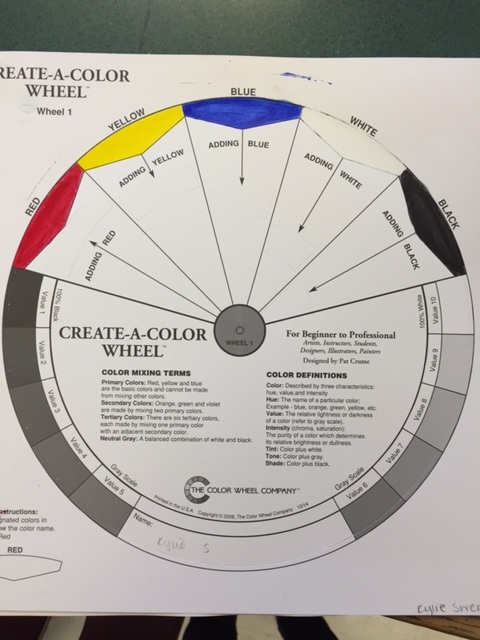 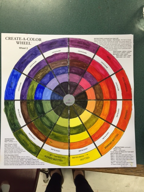 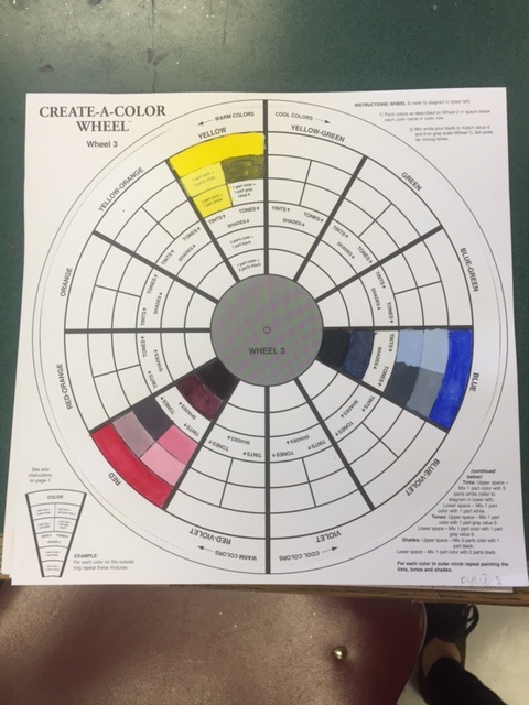 Doing this drawing was a lot of fun for me. I'm not completely proud of how it turned out, but I did try my best. If I could do it again I would make her larger to fill out the page more. I also wish she looked more realistic. I did use the cross hatching technique to shade, but I ended up blending it because it looked too awkward and pronounced. Overall I enjoyed this project.   I really liked doing the kinetic drawing because of the collaborating aspect. Johanna suggested things I wouldn't have even thought to do. I also like the way the dark and light blue looked together. 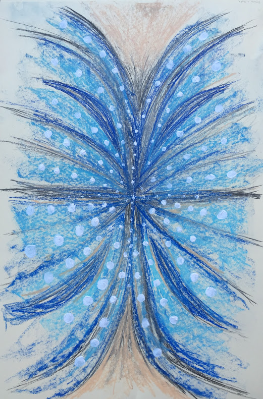 I really enjoyed the process of drawing the blind contour itself because I didn't have to worry about making the features perfect. Overall I was happy with how the faces turned out but I would do the coloring differently. I think I need to draw more attention to the center of the page rather than the edges. 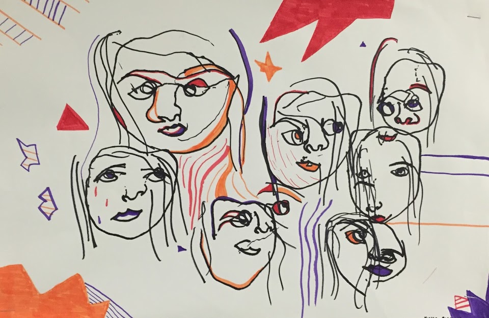 |
AuthorWrite something about yourself. No need to be fancy, just an overview. ArchivesCategories |
 RSS Feed
